Hoppin App Redesign
Rethinking mobility — creating a smoother, smarter experience for multi-modal transport users.
Overview
Hoppin is a platform designed to make public transportation more accessible by combining different modes of travel — buses, trains, shared bikes, and more — into one easy-to-use service.
Our task was to redesign the Hoppin mobile app to improve the user experience, make navigation more intuitive, and create a modern, friendly interface that encourages the use of sustainable transport.
Process
1. Research & Problem Analysis
We started by researching the existing Hoppin app, identifying pain points through user reviews, competitor analysis, and personal testing.
Key issues we found:
- Cluttered user interface and confusing navigation
- Not clear what the application was for
- Many possible options within one application
Based on this, we defined our main design goals: simplify the flow, prioritize important information, and create a seamless booking experience.
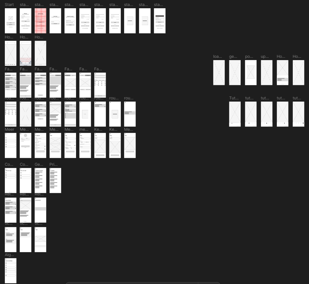
2. Wireframes
Wireframes helped us visualize the structure and iterate rapidly before moving into high-fidelity design.
3. Visual Design & Prototyping
For the visual style, we chose fresh, clean colors and friendly typography to make the app feel inviting and reliable.
We used Figma to design and prototype the screens, focusing heavily on accessibility: clear contrasts, readable fonts, and intuitive icons.
Highlights of the redesign:
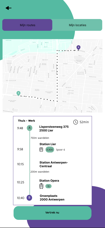
- A clean home screen with direct access to trip planning
- Real-time overview of available mobility options
- Streamlined booking process with clear feedback at every step
4. Final Result
The redesigned Hoppin app provides a much smoother, user-friendly experience — encouraging people to plan and book multi-modal journeys quickly and confidently.
It not only improves functionality but also builds trust in sustainable, shared transportation services.
Gallery